


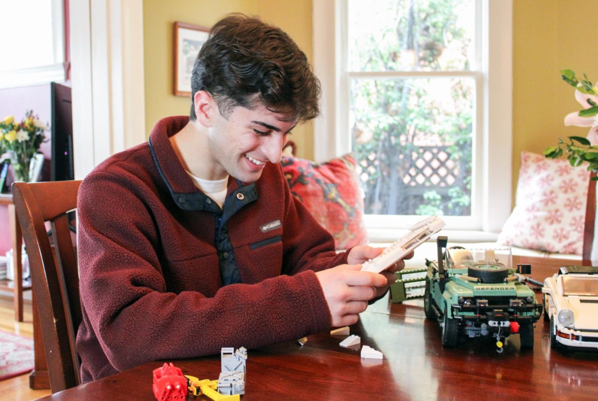
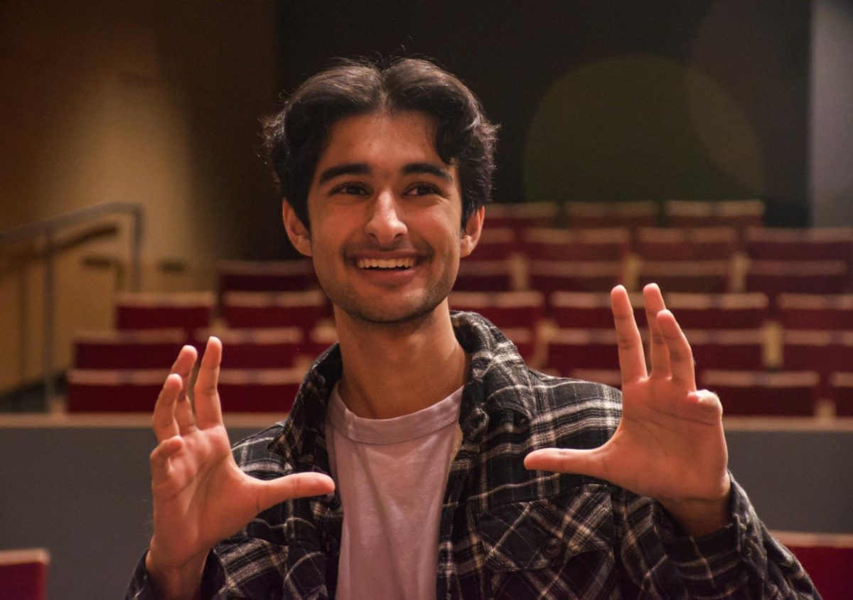
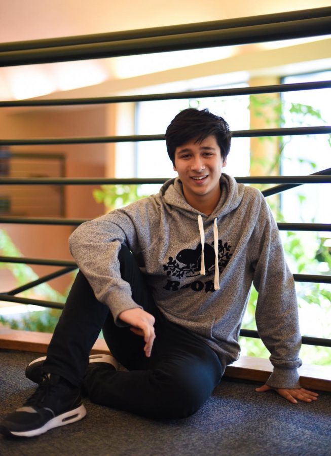
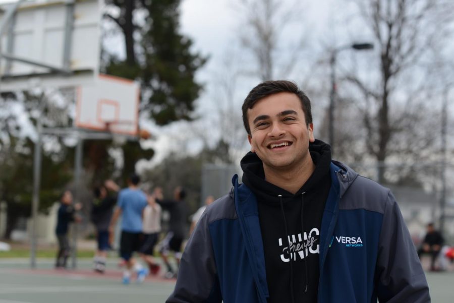
![“I wasn't discouraged by some of the obstacles we faced. I learned a lot from the leadership. I found that different people need different ways of receiving feedback — you can't [just] tell them to do something and expect the best. [Some] people needed more incentive. A large part of my role was to figure out what worked for everyone and to figure out how to lead all these separate individuals as a team,” Suhana Bhandare (’26) said.](https://harkeraquila.com/wp-content/uploads/2026/06/SuhanaBhandare_JasmineHansra-1-1200x798.jpg)
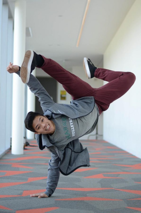
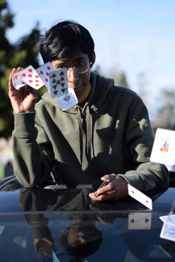
![“This is actually from Randy Pausch Randy P. Brick: ‘Walls are there for a reason. You have to show how much you want to overcome them.’ You have to show how much you want something. That's what I've always been able to do with tennis, Link Crew and getting that internship [with Kushy Baby]. It’s important pushing through that — getting around that brick wall, climbing over it or clawing through it,” Yash Sachdeva (’26) said.](https://harkeraquila.com/wp-content/uploads/2026/05/YashSachdeva_RamBatchu-copy-1200x1002.jpg)
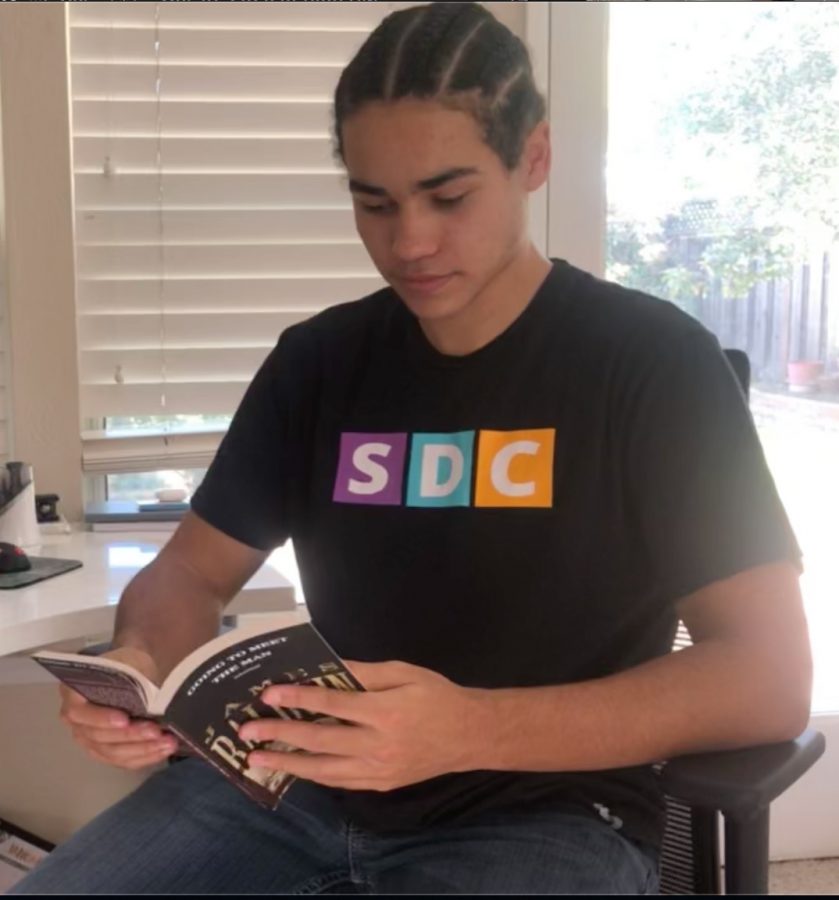
![“[Building nerf blasters] became this outlet of creativity for me that hasn't been matched by anything else. The process [of] making a build complete to your desire is such a painstakingly difficult process, but I've had to learn from [the skills needed from] soldering to proper painting. There's so many different options for everything, if you think about it, it exists. The best part is [that] if it doesn't exist, you can build it yourself," Ishaan Parate said.](https://harkeraquila.com/wp-content/uploads/2022/08/DSC_8149-900x604.jpg)
![“When I came into high school, I was ready to be a follower. But DECA was a game changer for me. It helped me overcome my fear of public speaking, and it's played such a major role in who I've become today. To be able to successfully lead a chapter of 150 students, an officer team and be one of the upperclassmen I once really admired is something I'm [really] proud of,” Anvitha Tummala ('21) said.](https://harkeraquila.com/wp-content/uploads/2021/07/Screen-Shot-2021-07-25-at-9.50.05-AM-900x594.png)

![“I think getting up in the morning and having a sense of purpose [is exciting]. I think without a certain amount of drive, life is kind of obsolete and mundane, and I think having that every single day is what makes each day unique and kind of makes life exciting,” Neymika Jain (12) said.](https://harkeraquila.com/wp-content/uploads/2017/06/Screen-Shot-2017-06-03-at-4.54.16-PM.png)

![“My slogan is ‘slow feet, don’t eat, and I’m hungry.’ You need to run fast to get where you are–you aren't going to get those championships if you aren't fast,” Angel Cervantes (12) said. “I want to do well in school on my tests and in track and win championships for my team. I live by that, [and] I can do that anywhere: in the classroom or on the field.”](https://harkeraquila.com/wp-content/uploads/2018/06/DSC5146-900x601.jpg)
![“[Volleyball has] taught me how to fall correctly, and another thing it taught is that you don’t have to be the best at something to be good at it. If you just hit the ball in a smart way, then it still scores points and you’re good at it. You could be a background player and still make a much bigger impact on the team than you would think,” Anya Gert (’20) said.](https://harkeraquila.com/wp-content/uploads/2020/06/AnnaGert_JinTuan_HoHPhotoEdited-600x900.jpeg)
![“I'm not nearly there yet, but [my confidence has] definitely been getting better since I was pretty shy and timid coming into Harker my freshman year. I know that there's a lot of people that are really confident in what they do, and I really admire them. Everyone's so driven and that has really pushed me to kind of try to find my own place in high school and be more confident,” Alyssa Huang (’20) said.](https://harkeraquila.com/wp-content/uploads/2020/06/AlyssaHuang_EmilyChen_HoHPhoto-900x749.jpeg)
SF MOMA modernizes
San Francisco Museum of Modern Art’s most recent expansion, the Snoøohetta building, celebartes a year of being open with a “Birthday Bash”
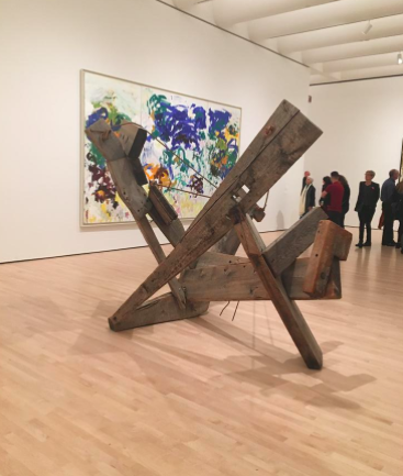
The bright red letters pop out from the white and gray exterior of the building, beckoning you in as you walk through the glass doors and into the San Francisco Museum of Modern Art’s (SFMOMA’s) maze of exhibitions and galleries. The contrast between the warm red and the stark white can be seen in all aspects of the museum’s recently opened Snohetta building, from its glossy facade to the items in the gift shop.
Walking around this building to the other side reveals a very different side of the museum. Made of red brick and black granite, the long-established Mario Botta building creates a stark contrast with the new Snohetta expansion, as it should—the Snohetta building was the result of a three-year-long project dedicating to promoting a new and more welcoming visual identity. And now that the new expansion has been open to the public for a year, SFMOMA is celebrating its opening.
When architect Mario Botta first set out to design a building for the SFMOMA, he wanted to create a landmark building that highlighted strength, using simple forms and geometric designs to create the five-story building.
“When the [Mario Botta building] was opened, the critique was that the building was dominant over the art that was put into it,” visual arts department chair Jaap Bongers said. “It was a very impressive building—the black granite showed a strong contrast of rough and polished—but the critique was that it had been overdesigned. And that’s a fine line that you have to walk.”
Since this landmark building was opened in 1995, the SFMOMA has made other adjustments to its structure as well, including the addition of a roof garden to the Mario Botta building. However, the largest addition yet is architecture company Snohetta’s 10-story expansion, which was unveiled last May.
The process first began in 2010, during which the leadership of the museum identified several principles that would be central to the design of the new building. These included Welcoming, Participatory, Surprising, Illuminating, Of Our Time, Boundaryless and Open. With these principles in mind, the SFMOMA Design Studio then began work on the new building.
“Our work began with a set of workshops in which members of staff, our board members and donors were invited to attend,” SFMOMA Design Director Jennifer Sonderby said. “During the workshops we looked at a gigantic wall filled with visual identities from other institutions and discussed which ones were meaningful and why. This active process provided an opportunity to explain how visual identities operate to all those that would be involved in the process.”
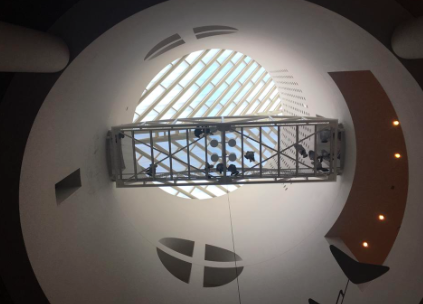
In addition to expanding the museum to almost three times its original size, museum directors and staff wanted to make the museum more accessible and welcoming toward the public.
“I would say that it was more crowded because it had just opened, but it was brighter and very cool in terms of the variety of the mediums they had, such as a wall just for nature,” said AP Art History student Andrea Simonian (10), who visited the new expansion soon after it was built. “It had a very clean design, but I think that if they were trying to make it more welcoming, the fact that there were so many people there made it harder to be personal.”
Changes to the museum’s design included a redesign of the logo using a new typeface and a new color palette featuring warm red, white and black that echoes both the older design of the Mario Botta building and the new Snohetta building.
“The visual identity helped to seam the exteriors of the old and new buildings together with signage,” Sonderby said. “Large scale logos have been installed on the two different facades of the museum. A warm red logo is placed on the white facade of the new Snohetta-designed building that faces Howard Street and a white logo has been installed on the warm red brick of the Mario Botta-designed building that faces Third Street.”
SFMOMA staff also attempted to incorporate attributes of both San Francisco and the general Bay Area into their new design, such as the distinctive fog patterns in the city as well as the hills surrounding the museum.
SFMOMA held a Birthday Bash for the one-year anniversary of the creation of the expansion on Apr. 26.
This piece was originally published in the pages of The Winged Post on May 11, 2017
Katherine Zhang (12) is the co-editor-in-chief of the Winged Post, and this is her fourth year on staff. Kat most enjoys seeing the paper come together...
Rose Guan (10) is a copy editor for the Winged Post in her second year on staff. She was a reporter in her freshman year, and her favorite aspect of journalism...